MrW has been raving about the new Valspar paint collection at B&Q for the past few weeks and so I had to go and see it for myself and WOW! The display is nothing short of impressive with hundreds of choices all neatly tucked away under three different light displays so you can see what the testers look like in natural florescent or LED lighting The nations favourite DIY centre has finally realised that Dulux has been reduced to nothing better than coloured water and replaced it with the American brand who promise that their paints can't be beaten. So I'm ready to put this to the test!
First things first, pick the colour. MrW shares my passion for colour and interiors and thankfully we have very similar taste so when I put forward the idea of grey and teal on our bedroom he loved it! Our bedding is white with teal details, a decision we made nearly 3 years ago when we got married as we were wanting a colour scheme we both liked - no pink or lacy bits allowed apparently! Our bedroom is at the back of the house, which sadly faces north. This means that the light is totally different to the front of the house where the sun streams in. We quickly discovered that greys on the blue end of the spectrum were not going to work as they made the room feel cold and dark, while greys with a purple tinge looked dirty. We settled, after several attempts on a gorgeous grey with brown highlights. As an experiment we tried it in the living room at the front of the house and it looked an awful beige but in our cold north light bedroom it morphs in to a warm gorgeous grey! Clay Figurine it is - another highlight of Valspar is the really lovely names they give their paints!
First things first, pick the colour. MrW shares my passion for colour and interiors and thankfully we have very similar taste so when I put forward the idea of grey and teal on our bedroom he loved it! Our bedding is white with teal details, a decision we made nearly 3 years ago when we got married as we were wanting a colour scheme we both liked - no pink or lacy bits allowed apparently! Our bedroom is at the back of the house, which sadly faces north. This means that the light is totally different to the front of the house where the sun streams in. We quickly discovered that greys on the blue end of the spectrum were not going to work as they made the room feel cold and dark, while greys with a purple tinge looked dirty. We settled, after several attempts on a gorgeous grey with brown highlights. As an experiment we tried it in the living room at the front of the house and it looked an awful beige but in our cold north light bedroom it morphs in to a warm gorgeous grey! Clay Figurine it is - another highlight of Valspar is the really lovely names they give their paints!
| And in a bold move I took the decision to go for it and paint the whole room. No simple feature walls for this house, bold statements is what we are going for! This picture does not do it justice, but whilst painting at midnight taking photos wasn't on the priority list! I would like to get a roller stencil to roll a pattern in teal on to the wall behind our bed which will tie in nicely to other highlights. I also plan to print and sew a roman blind or curtains with the same pattern the bottom of the fabric so that it ties in but isn't overwhelming. We are also going to build a wardrobe in to the alcove to the right of the chimney, all in good time! Lx | 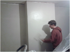 |
